


Making-Of and Sources
Our goal was to make the website user-friendly, fast and compatible. To achieve this goal, we tested and optimized our website with different browsers and internet speeds on several desktop and mobile devices. In addition to numerous established frameworks, we also make use of some innovations we developed ourselves, which we would like to briefly introduce below. We did not use any style templates or predefined themes.
Used technologies
Django

HTML5, CSS3 & JS

Materialize

MySQL

Own Improvements

Quadrilingual
In order to make the content of our website understandable for our American, Spanish, French and German visitors, we offer our website in four languages. For this purpose, the language is determined automatically based on the browser language. However, if necessary, the language can be changed at any time using the drop-down menu in the navigation bar.
Resource efficient
Resource efficiency is a top priority for us, not only because many of our visitors access our site from across the Atlantic. We also want to keep performance high and load times low on mobile devices, which often have lower performance or poorer internet connections. For this reason, we have compressed all images on our website to minimize download times. In addition, most of our website is available offline as soon as you visit it for the first time.
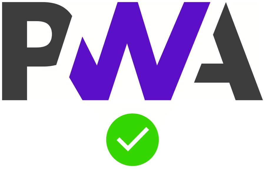
Available as an app
With smartphones emerging as the primary way to view websites, we sought to enhance the user experience and recreate the feel of a native app on these devices. To achieve this, we decided to make our website a Progressive Web App. This allows the user to download the website and run it offline, just as they would with any other app.
Student Copyright Checklist
Click here to view the Student Copyright ChecklistPlan of Work log
Click here to view the Plan of Work logSources
- TechEdu: Icons
- From http://www.flaticon.com
- Made by Vectors Market
- Last visited: May 14, 2022
- Making-Of: Django Logo
- From https://cdn.icon-icons.com/icons2/2415/PNG/512/django_plain_logo_icon_146558.png
- Last visited: April 19, 2022
- Making-Of: MySQL Logo
- From https://labs.mysql.com/common/logos/mysql-logo.svg
- Image has been modified
- Last visited: April 19, 2022
- Making-Of: Materialize Logo
- From https://materializecss.com/res/materialize.svg
- Image has been modified
- Last visited: April 19, 2022
- Projects: Scientific Visualization
- From https://pixabay.com/illustrations/bacteria-illness-virus-infection-163711/
- Last visited: April 20, 2022
- Projects: Cybersecurity
- From https://pixabay.com/illustrations/security-cyber-internet-computer-4907127/
- Last visited: April 20, 2022
- Projects: Biotechnology Design
- From https://pixabay.com/photos/analysis-biochemistry-biologist-2030265/
- Last visited: April 20, 2022
- Projects: Children's Stories
- From https://pixabay.com/photos/boy-child-male-young-reading-kid-4793110/
- Last visited: April 20, 2022
- Projects: Photographic Technology
- From https://pixabay.com/photos/camera-aperture-digital-camera-dslr-1239384/
- Last visited: April 20, 2022
- Projects: Board Game Design
- From https://pixabay.com/photos/dice-game-board-games-6963525/
- Last visited: April 20, 2022
- Projects: Data Science and Analytics
- From https://pixabay.com/photos/digital-marketing-seo-google-1725340/
- Last visited: April 20, 2022
- Projects: Video Game Design
- From https://pixabay.com/photos/games-gaming-consoles-ps4-gamepad-2453777/
- Last visited: April 20, 2022
- Projects: Fashion Design
- From https://pixabay.com/photos/mannequin-fashion-accessory-2566559/
- Last visited: April 20, 2022
- Projects: Music Production
- From https://pixabay.com/photos/microphone-headphones-music-mic-5046876/
- Last visited: April 20, 2022
- Projects: Extemporaneous Speech
- From https://pixabay.com/photos/public-speaking-mic-microphone-3926344/
- Last visited: April 20, 2022
- Projects: Coding
- From https://pixabay.com/photos/source-code-software-computer-4280758/
- Last visited: April 20, 2022
- Projects: Digital Video Production
- From https://pixabay.com/photos/video-production-video-movie-film-4223885/
- Last visited: April 20, 2022
- Homepage, About TSA: Facts
- From https://tsaweb.org/docs/default-source/toolkits/tsa-facts-2021.pdf
- Last visited: May 14, 2022
- Projects: Technology Problem Solving
- From https://unsplash.com/photos/2EJCSULRwC8
- Made by Alex Knight
- Last visited: April 20, 2022
- Projects: On Demand Video
- From https://unsplash.com/photos/dozkVhDyvhQ
- Made by Patrick
- Last visited: April 20, 2022
- Projects: Prepared Presentation
- From https://unsplash.com/photos/MAYsdoYpGuk
- Made by Alex Litvin
- Last visited: April 20, 2022
- Projects: Audio Podcasting
- From https://unsplash.com/photos/ZDNyhmgkZlQ
- Made by Will Francis
- Last visited: Sept. 30, 2022
- Projects: Promotional Design
- From https://unsplash.com/photos/ZSPBhokqDMc
- Made by https://unsplash.com/photos/ZSPBhokqDMc
- Last visited: April 20, 2022
- Making-Of: PWA Logo
- From https://upload.wikimedia.org/wikipedia/commons/thumb/d/d5/Progressive_Web_Apps_Logo.svg/512px-Progressive_Web_Apps_Logo.svg.png
- Made by Diego González-Zúñiga, CC0, via Wikimedia Commons
- Image has been modified
- Last visited: April 19, 2022
- TechEdu: Icons
- From https://www.flaticon.com/
- Made by freepik
- Last visited: May 14, 2022
- TechEdu: Icons
- From https://www.flaticon.com/
- Made by Pixel Buddha
- Last visited: May 14, 2022
- TechEdu: Icons
- From https://www.flaticon.com/
- Made by Smashicons
- Last visited: May 14, 2022
- TechEdu: Icons
- From https://www.flaticon.com/
- Made by Smashicons
- Last visited: May 14, 2022
- Making-Of: HTML5, CSS3 & JS Logo
- From https://www.pngaaa.com/detail/4253340
- Image has been modified
- Last visited: April 19, 2022